As I was moving a bunch of pictures from an old harddrive to a new one the other day, I thought I might share with you some of the amazing works of architecture I've visited on study trips over the years. I guess I already started in my previous post. From the rusty, decaying war machine in the middle of the ocean, this one is the complete opposite. It's a beautiful house, a piece of jewellery almost. I always appreciate works that take me by surprise, even provoke me, but at first glance this one is just beautiful. These iconic mid century houses are not very relevant to our daily architecture struggles, but they were often subject to a lot of controversy at the time they were built, and that is something we should learn from. Not that we should cause a stir for the sake of controversy, but we could all be more stubborn and courageous in our endeavours to push the field of architecture further.
Philip Johnson's Glass House is mostly hidden from the street in a vast green estate, or park, rather. It lies behind a stone wall
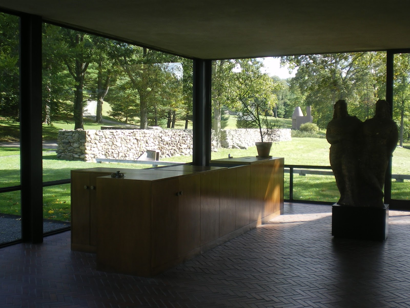
at the edge of a crest in his estate overlooking a pond. A short walk over grass and gravel paths takes you to the house. The house is a simple rectangular glass and charcoal- painted steel structure. The kitchen, dining and sleeping areas are all in one
glass-enclosed room. The space is divided by low walnut cabinets; a brick
cylinder containing the bathroom is the only object to reach floor to
ceiling. This is the only room that is sheltered from the outside.


The Glass House builds on ideas of German architects from the 1920s
("Glasarchitektur"). In a house of glass, the views of the landscape are
its “wallpaper”. I have very expensive wallpaper, Johnson once
said. Johnson was inspired by the design of Mies van der Rohe. Being a
huge Mies van der Rohe fan, I used to think Philip Johnsons Glass House
(1949) had too many similarities to the Farnsworth house (if you don't
know it, google it- you're in for a treat). So many that I didn't really
pay too much attention to it. I was lucky enough to visit it in New
Canaan, Connecticut some years ago, and realized that apart from the
aparent similarities, there's a major conceptual difference that
"justifies" it. Whereas the Farnsworth house floats above the ground,
the Glass House is heavily grounded. It's floor is a "cultivated" piece
of the ground beneath it, paved with brick, while the floor of the
Farnsworth house is a part of the steel structure that balances on
slender columns that touch the ground, like a spaceship that just
landed. The relationship to the ground is also reflected in the use of
materials. The brick refers to the ground.

The Glass House itself is inferior
to Farnsworth House in "intellectual rigor" and exquisite detailing,
according to Nicolai Ouroussoff. For instance, he wrote, the steel
I-beams at the corners of Johnson's building "are clumsily detailed —
especially disconcerting in a work of such purity." Nevertheless, the
building is "a legitimate aesthetic triumph", with the glass walls
beautifully layering silhouetted and reflected images layered on each
other, the critic wrote. "The classical references alluded to by its
thin brick base and the symmetrical proportions of its frame demonstrate
the range of Johnson’s historical knowledge."
As a curator at the Museum of Modern Art, Johnson had publicized Mies' work, and the American acknowledged his debt to the German architect, particularly in a 1950 interview in Architectural Digest magazine. Even though Johnson's building was completed a year before Mies's glass house, Johnson's building "was universally viewed as having been derived from it", according to Alice T. Friedman, architectural historian and professor of American art history at Wellesley. Johnson curated an exhibit of Mies work at the Museum of Modern Art in 1947, featuring a model of the Farnsworth House.
The
building created such a stir that at one point a police officer was
posted nearby to keep out trespassers, and Johnson put up a sign near
the street, stating: "This House Is Now Occupied Please Respect the
Privacy of the Owner. The home also created a stir for Mies van der
Rohe, who "stormed out in a huff when he saw it", Ouroussoff, a New York
Times architecture critic, wrote. Obviously derived from Mies's
Farnsworth House, the fact that it was finished earlier could easily
have made the German architect wonder whether others would get the
impression that Johnson had instead done pioneering work for Mies, and
it could be seen that "Johnson’s vision lacked the intellectual rigor
and exquisite detailing that were so critical to Mies’s genius",
according to Ouroussoff.
As a curator at the Museum of Modern Art, Johnson had publicized Mies' work, and the American acknowledged his debt to the German architect, particularly in a 1950 interview in Architectural Digest magazine. Even though Johnson's building was completed a year before Mies's glass house, Johnson's building "was universally viewed as having been derived from it", according to Alice T. Friedman, architectural historian and professor of American art history at Wellesley. Johnson curated an exhibit of Mies work at the Museum of Modern Art in 1947, featuring a model of the Farnsworth House.
The Glass House resulted in
recognition for Johnson, not just in architectural circles, but among
the public at large. The house was featured in LIFE magazine, and the
New York Times Magazine published a set of cartoons about it. "What
really sets Johnson apart (...)" Michael Sorkin wrote in 1978, "is his
aptitude for publicity (...) If it was Mies van der Rohe who provided
the real inspiration for the Glass House (...) it was only Johnson who
could have built the house and lived in it himself. Johnson's career
began when he turned himself into the Man in the Glass House. In an
instant, he became the austere apostle for modern architecture- or
rather the modern apostle for austere architecture."

Most of the furniture is designed by Mies van der Rohe.


The
most controversial, as well as stunning, feature of this house is,
obviously, the deegree of transparancy. Remember this was 1949. We
probably all agree that it's a beautiful house, but was it a good home?
Johnson eventually abandoned
it and used it only for entertaining. He slept in the Brick House,
which was initially used for guest rooms. In my mind, this suggests that
he realised that he'd stretched his transparent living experiment too
far. The house turned into a modernist showroom or pavillion instead of a
home. Architecture that doesn't "work" feels a bit hollow. Often the
emphasis on the aesthetics has been to strong. It's not
hard to design a beautiful pavillion, combining beauty with
all the aspects of functionality is more challenging and puts your
aesthetic choises to the test.
Don't get me wrong, I love this house, it's absolutely stunning, but it's a pavillion, not a home. After more than 60 years, we still find the Glass House beautiful, but extremely challenging. Being sheltered and having one's back covered are fundamental human needs that seem unaffected by time. Even surrounded by your own private park, the feeling when it gets dark and outside makes you feel very vulnerable. The Farnsworth hose has floor to ceiling curtains, which, as some say, are a sign of a failed concept. I don't agree at all. I think the curtains are a beautiful feature, and gives the house an almost immaterial glow when viewed in the dark from the outside. I think we're still not ready for life in the Glass House. Which, of course, makes it even more intriguing!
Don't get me wrong, I love this house, it's absolutely stunning, but it's a pavillion, not a home. After more than 60 years, we still find the Glass House beautiful, but extremely challenging. Being sheltered and having one's back covered are fundamental human needs that seem unaffected by time. Even surrounded by your own private park, the feeling when it gets dark and outside makes you feel very vulnerable. The Farnsworth hose has floor to ceiling curtains, which, as some say, are a sign of a failed concept. I don't agree at all. I think the curtains are a beautiful feature, and gives the house an almost immaterial glow when viewed in the dark from the outside. I think we're still not ready for life in the Glass House. Which, of course, makes it even more intriguing!


To the left, the sculpture Two circus women by Elie Nadalman, 1930


This picture is so bad, my apologies for adding it, but I just had to show you this column. It captures the essence of what I love so much about modernist steel and glass architecture. It's the use of standard steel elements, the appreciation of the aesthetics of the constructive, loadbearing elements. This exudes honesty, nothing is covered or hidden. Mies van der Rohe was the master of this, his repertoir of steel elements is amazing, the constructions are so elegant that no extra fuss is needed. Less is indeed more.


The room- dividing cabinets is a feature that I really, really love. The wood surfaces are so beautiful and add so much warmth. Check out the cabinets in the Farnsworth house too- oh my goodness...


Johnson lived in the Glass house with his partner of 45 years, David
Whitney, the curator, collector and advocate of modern art. The landscape surrounding
the buildings was designed by Johnson and Whitney, with "manicured"
areas of gravel or grass, trees grouped in what Johnson called outdoor
"vestibules", and with care taken in the shape of the slopes and curves
of the ground. In part, the landscape was a reflection of a landscape
painting, The Funeral of Phocion by Nicolas Poussin (circa 1648) placed
in a seating area of Glass House. The estate overlooks the valley of the
small Rippowam River to the west (seen from the back of Glass House,
past a grassy rise). To the north and south are sloping scenery that
particularly mimic the painting. The landscape design is another fundamental difference from the Farnsworth house,
which is situated in a natural wood.
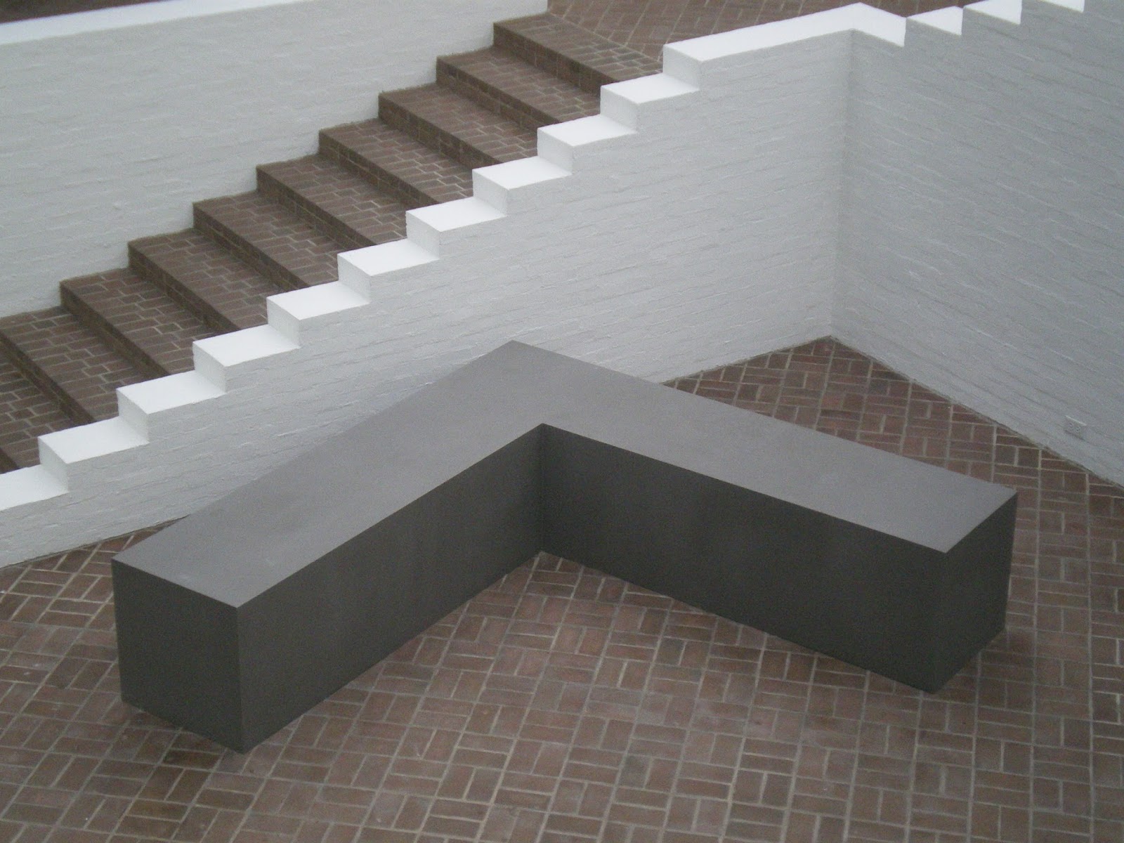
Johnson designed the Painting gallery (completed in 1965) to house the collection of large scale modern paintings that he and Whitney collected throughout their lifetimes. It contains works by Frank Stella, Andy warhol, Robert Rauschenberg, Cindy Sherman and Julian Schnabel. The exterior is a grass covered mound with a monumental entrance, inspired by ancient tombs.


Philip Johnson by Andy Warhol, 1972


The sculpture gallery was completed in 1970. It has a glass ceiling supported by tubular steel rafters, that cast a complew pattern of light and shadows. This building was Johnsons favorite and he seriously considered moving in.


Raft of the Medusa by Frank Stella, 1990


Neon templates of the left half of my body taken at ten inch intervals by Bruce Nauman, 1966


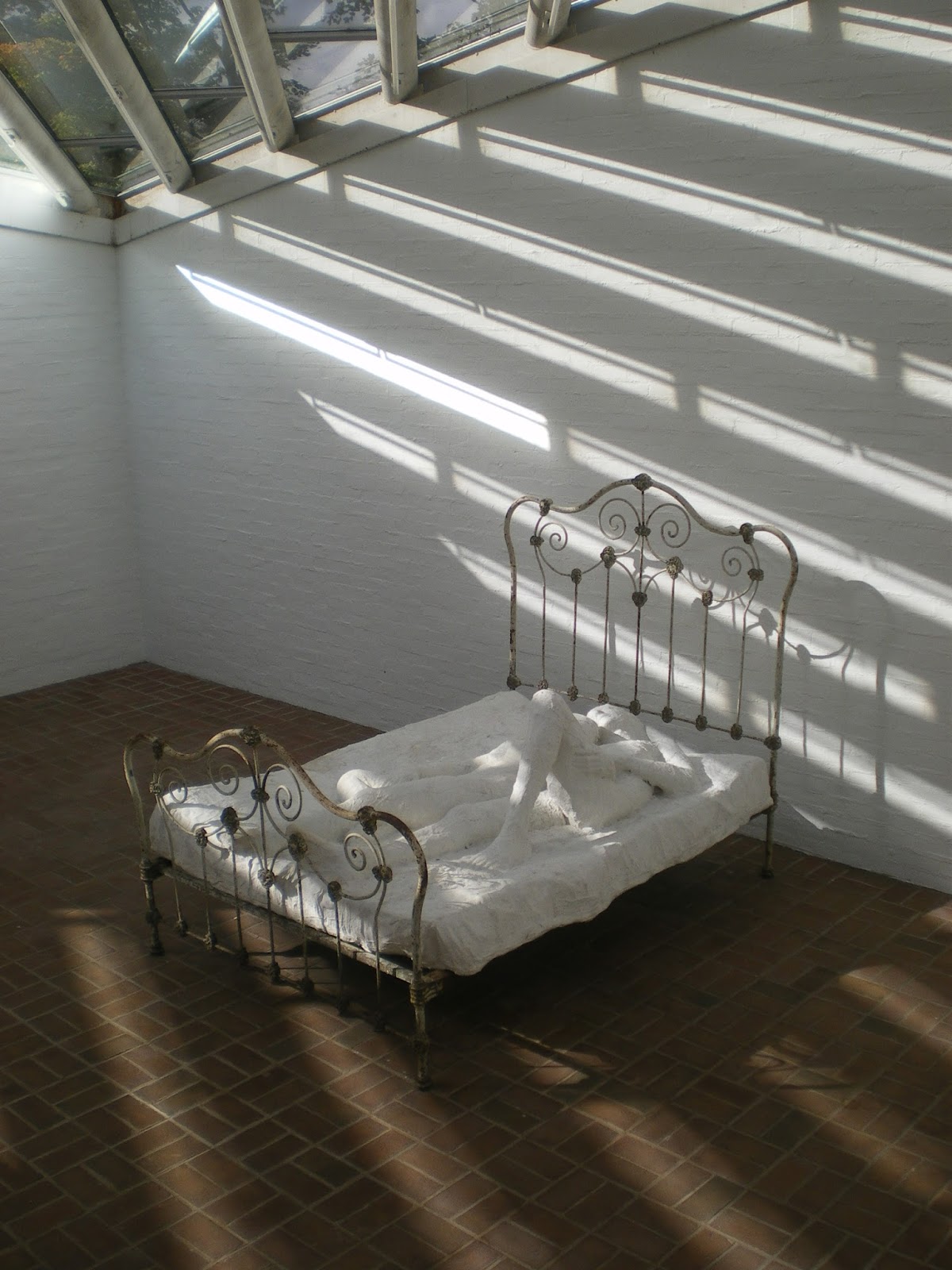
Lovers on a bed II by George Segal, 1970

Robert Rauschenberg's Empire II, 1961 (above)

The Archbishop, the golfer and Ralph by John Chamberlain, 1982- 83


Johnson wanted to preserve his estate as a public monument. The house was declared a National Historic Landmark in 1997. It was the place of Philip Johnson's passing on January 25, 2005 at the age of 98. Johnson passed on ownership of the Glass House to the National Trust for Historic Preservation, which opened it to visitors in April 2007.
The grounds contain several follies, or pavillions in addition to the two gallery buildings mentioned above. They are all radically different in style, so much so, that I found it a bit too much. I didn't photograph them all, I kept my focus on the "crown jewel" the Glass House. If you want to see more, I can highly recommend a visit to philipjohnsonglasshouse.org

Great photos, Tove. It's wonderful, especially someone in your profession, to see such structures. I watched a wonderful documentary about the Farnsworth house and how it was saved and the money and effort that went into saving/preserving it. It was fascinating. I hope to visit one day.
ReplyDeleteAs someone who lives in a home with lots of glass I can tell you that this may be "too much of a good thing". I agree with you about the curtains. It doesn't defeat the purpose or ruin the design. Honestly night time is when a house like this turns into a big dark cave. During the day it's light and beautiful but at night the darkness sucks all the light out of the house and it's depressing! The curtains, in my opinion, are smart as they allow for daylight and then closed at night they provide a barrier to the outside world and allow light to reflect back into the home. It's a great answer.
Thanks for sharing. I really enjoyed see all of YOUR pictures. Lovely!
You're very welcome:-) Thank you so much for your sweet comment, Stacey! I really enjoyed reading about your personal experience of living in a house with lots of glass. I would have loved to see that documentary, I've always loved the Farnsworth house, not many houses surpass it in beauty, it's such a wonderful combination of breathtaking beauty and that "spaceship- effect". Love it!!! I also love the forest quality of the site, the grounds of the Glass house are too manicured for my taste. I tried to arrange for a trip to see the Farnsworth house the last time I was in Chicago, but was unsuccessful... I did manage to see Crown Hall and Lake Shore Drive as well as several Frank Lloyd Wright houses, though:-)
DeleteWhat a superb post Tove. Your posts are always eye opening. I have often seen the glass house from the outside - but never much of the inside - Wonderful details - like the brick floor and bathroom I didn't know about. Fascinating also about the galleries and follies I wasn't aware of. I think you and Stacey have got it spot on about curtaining - it would be great to live in during the day...but at night the lack of curtains would be light (and life) sucking. An inspiring read.
ReplyDeleteWhat a lovely comment Ray, it really means a lot to me that you find my posts worth while! Before visiting the I didn't know about the other buildings on the estate either. I thought they were a rather strange collection of small buildings in different styles, with no aesthetic relation to wach other. The interior of the Glass house was beautiful. The brick floor and bathroom cylinder were such great features and added warmth and character to the material palette, and of course, the furniture was absolutely gorgeous! Thanks again for the kind words, Ray!
Deleteyes, i can imagine trying to live there could make one feel a bit naked. i love the herringbone brick floor. thanks for bringing this place to my attention, i've never even heard of it before x
ReplyDeleteMy pleasure, Max! Yes, it was just like being outside! I can just imagine being there in the evening, not being able to see what's outside and knowing you're as exposed as an illuminated billboard! But as an object it's absolutely stunning. It's one of those icons of modernism that architects drool over:-) It was a bit like seeing the Mona Lisa, when you've seen something in pictures so many times it feels surreal to finally see it in real life, right?
DeleteYes, beautiful as a pavilion, but I can see that it would be difficult to live in. I think most of us have the need for complete privacy sometimes, and I don't know how you would ever feel you'd achieved that in the Glass House.
ReplyDeleteI think that the curtains at the Farnsworth House, coupled with the sizeable area where the dividing walls go almost to the ceiling, made it feel more like a residence.
I agree, Dana, I think the Farnsworth house is more a residence too! The dividing walls and kitchen divides it into zones that are more reminiscent of rooms. And I think the roof over the terrace helps shelter it too. The curtains are a beautiful feature. The Farnsworth house is by far my favorite of the two, I've always adored it, much because of the way it has "landed" among those trees. We discussed the Glass house A LOT on that trip and everyone admitted, as much as we loved the look of it, that we couldn't live there... Loved hearing about your reflections, Dana!
Delete