Sunday, January 19, 2014

Thrifts and treasures


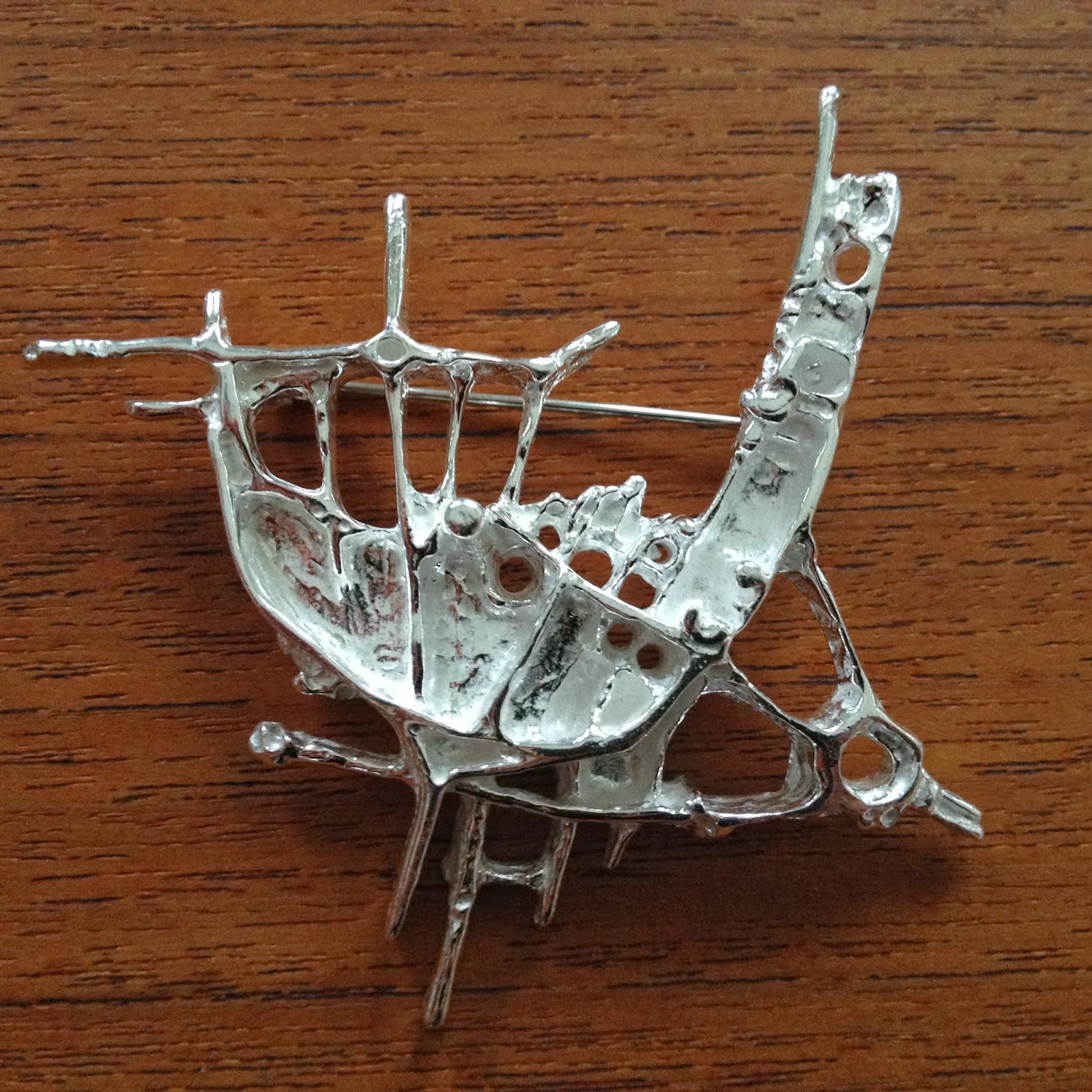
I spent last weekend in Stavanger at my parents house, just relaxing, taking in the salty North sea air, watching the waves, photographing, having delicious prawns and doing no (yes, that's right:-) thrifting! Still, I managed to bring home some treasures. My dad's been at it again, and has made me another gorgeous bag. He makes them out of thick, delicious, natural tan leather that turn into a wonderful golden brown after some use and a few rounds of beezwax. I've had the large bag to the right for around a year. It's my everyday bag that I use for work. It has a long strap and can carry just about anything, my laptop, umbrella, hairbrush etc. The new bag is a much smaller size with a short strap. I'm such a lucky girl, he's made me a camera bag, belt and make- up bag. Apart from the unsurpassed leather and handcrafted quality, they're extra precious because dad made them! See more pics here.


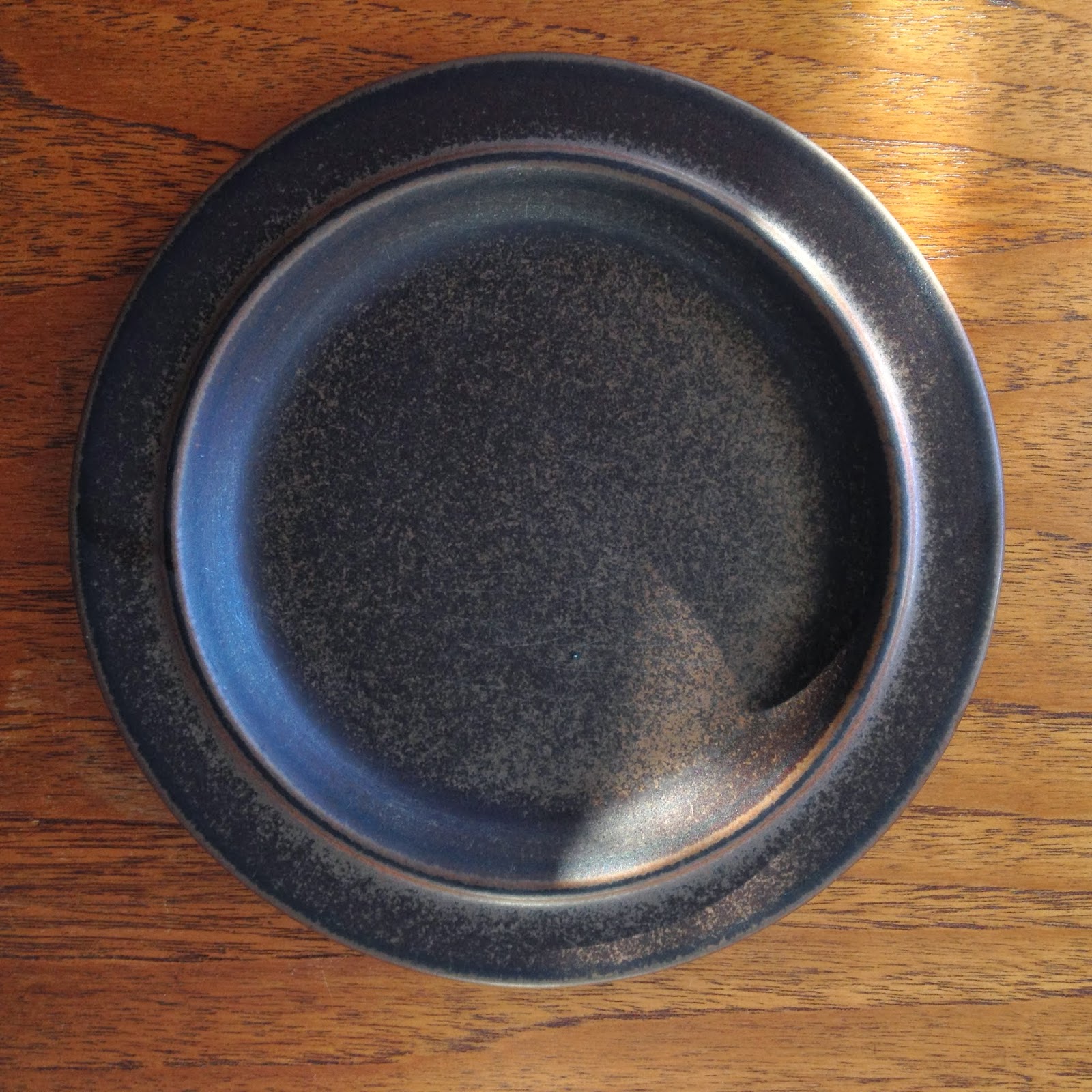
I also brought home some of my grandmothers old pottery. Aren't they lovely? The one to the left is traditional Sandnes pottery. It's not stamped, but it must be either Gann, Graveren or Gann Graveren (after the two companies merged). My collection of this pottery is now quite numerous, and this is the smallest one until now, it's only 13 cm tall (the largest one is almost 40 cm and is the home of a large Monstera). My dad told me he remembers his mother used it for jam. It has a little less glaze than the bigger ones. The two planters in the middle are unmarked, and I have no idea who made them. They have an unusual glaze that's quite lovely. The last and biggest one is Strehla.


Do you remember I showed you my husband's lovely Stavangerflint plate that he had as a child? The pattern is "Venner" (Friends) and was designed by Gro Pedersen Claussen. My mum let me take my own Stavangerflint set back with me. The pattern is called "O du som metter liten fugl" and was designed by Anne Lofthus. I remember how I knew the pattern by heart and made up stories about the little birds and animals. I showed it on Instagram today, and got the sweetest comment from a lady from my home town, saying she remembers it from her kindergarden in the late 60s. She also told me she was sure one of the birds was named after her sister. I guess this shows how important the visual surroundings are for a child's imagination.


This weekend has been busy, but I managed to squeeze in a short stop at my nearest thrift store yesterday. It's a large shed really, but the owner really makes an effort, she lights candles and plays 30s music, trying to create a vintage atmosphere, she's a really sweet woman. I do pick up the occasional treasure there, this time I found these following pieces.

First out, a lovely little pitcher in Brunette by Stavangerflint. It's bigger than a creamer, smaller than a jug, perfect for custard or some other dessert sauce. Of course, a little bouquet of wild flowers would look just perfect in it too! Brunette was designed by Kåre Berven Fjeldsaa in the 60s.


I was really thrilled to find two Stavangerflint "Mesterkokken" (Chef) dishes. The pattern was designed, silkscreened and handcolored by Inger Waage, and also came in blue. The design is from around the same time as "Bambus", as the same techniques were used. There was a tv-show made by BBC in 1961 that featured Inger Waage and her design "Mesterkokken", which means it was designed in 60 or 61, or maybe even the late 50s.
The pattern is a feast for the eye, so quirky and rich in detail. The colors are a combo I haven't really seen before, reddish brown, yellow and teal. They look great together. The blue version makes me think of the great dutch patterns used on Delft and the likes. I found two old pictures on the web, probably from Stavangerflint ads, of tables set with the two versions of the design. I must say those flower arrangements surpass mine by far!! That wooden backdrop is gorgeous, don't you think?


Not quite so quirky is this simple award- winning Hadeland "Multe" (cloudberry) bowl, designed by Willy Johansson in 1966. I really looks like it could have been designed today, doesn't it? I've found two larger bowls in this lovely smokey grey earlier. The design also comes in a deep emerald green.

 
Finally, a small Stavangerflint souvenir dish, handpainted by Inger Waage. It shows scenes from the city of Bergen, Norway's second largest city which is known for it's picturesque city centre, surrounded by mountains.


Thursday, January 09, 2014

The High Line

On Christmas day we went for a walk on Manhattan, through Greenwich Village, Soho and the Meatpacking district. I love the color and textures of these neighborhoods, the low (for New York!) brownstone buildings, the former industrial buildings turned art galleries, apartments and boutiques, and the not quite so touristy atmosphere. 


I was quite taken with this recent piece of architecture that blended so beautifully in amongst the brownstones. The street facade is clad in Corten steel, and I'm guessing it has a higher degree of transparency on the opposite facade.

Always when I travel, I have a list of what I want to see, both art and architecture, and drag my poor husband and kids around... This time in New York, I only had two things on my list: the occasional public sculpture and The High line. I had really high (excuse the pun, couldn’t resist) hopes for The High Line, and I was not disappointed. I’m a firm believer in new thinking around established phenomena, in this case the urban public park. To be elevated above street level and experience the city from another viewpoint had a greater impact on me than what I expected. It’s also an efficient use of valuable street level space and, most importantly, reusing excisting structures is both ecological and creates some unexpected spaces with valuable links to the past. I can highly recommend it, if you haven’t been there already.

The High Line is a public park built on an historic freight rail line elevated above the streets on Manhattan’s West Side. The first section of the High Line opened in 2009. It runs from Gansevoort Street in the Meatpacking District to West 20th Street. The second section, which runs between West 20th and West 30th Streets, opened two years later. 


The High Line is owned by the City of New York, and maintained and operated by Friends of the High Line. Founded in 1999 by community residents, Friends of the High Line fought for the High Line’s preservation and transformation at a time when the historic structure was under the threat of demolition. In addition to overseeing maintenance, operations, and public programming for the park, Friends of the High Line works to raise the essential private funds to support more than 90 percent of the park’s annual operating budget, and to advocate for the preservation and transformation of the High Line at the Rail Yards, the third and final section of the historic structure, which runs between West 30th and West 34th Streets.

The High Line was built in the 1930s, as part of a massive public-private infrastructure project called the West Side Improvement. It lifted freight traffic 30 feet in the air, removing dangerous trains from the streets of Manhattan's largest industrial district. No trains have run on the High Line for more than three decades. The last train chugged along the High Line in 1980, carrying three carloads of frozen turkeys.


The design team of landscape architects James Corner Field Operations, with architects Diller Scofidio + Renfro, created the High Line's public landscape. Construction on the park began in 2006. For a relatively narrow and straight stretch of parallel tracks, I was impressed with the great variety of spaces they've created. The High Line's planting design is inspired by the self-seeded landscape that grew on the out-of-use elevated rail tracks during the 25 years after trains stopped running. Many of the species that originally grew on the High Line's rail bed are incorporated into the park's landscape. It may sound funny, but I really liked the winter dullness of the plants, all brown and not much to look at. It really added to the intended effect of the natural elements taking over an old industrial installation.


In recent years, the High Line has been adding interesting art along its length and even on the billboards facing the linear park. Now, public art seems to be spreading outwards into neighboring Chelsea, a long-time gallery destination.

“The river that flows both ways”. This installation is part of High Line Art, a program that introduces site-specific works that respond to the park’s unique qualities.Inspired by the Hudson River, Spencer Finch’s The River That Flows Both Ways (between West 15th and West 16th Streets) documents a 700-minute (11 hours, 40 minutes) journey on the river in a single day. The title is a translation of Muhheakantuck, the Native American name for the Hudson, referring to the river’s natural flow in two directions. Like the rail line that existed on the High Line, the Hudson River was, and still is, an active route for the transportation of goods into Manhattan. The river and the High Line have always been linked in their geography, their function, and their imprints on the industrial legacy of the city. 


From a tugboat drifting on Manhattan’s west side and past the High Line, Finch photographed the river’s surface once every minute. The color of each pane of glass was based on a single pixel point in each photograph and arranged chronologically in the tunnel’s existing steel mullions. Time is translated into a grid, reading from left to right and top to bottom, capturing the varied reflective and translucent conditions of the water’s surface. The work, like the river, is experienced differently depending on the light levels and atmospheric conditions of the site. In this narrative orientation, the glass reveals Finch’s impossible quest for the color of water. I really loved how the artist used an existing structure (the old framework) to create something new. It reminded me a bit of the modern, pixelated new take on the stained glass window in the Cologne cathedral by one of my many favorites, Gerhard Richter. 


“Busted” is a series of contemporary busts amid the High Line’s public gardens. Artist Steven Claydon, created UNLIMITEDS & LIMITERS, which humorously plays with the idea of the traditional bust, with doubles in resin and concrete. 


Getty Station is a public art program based at the former Getty filling station conceived by real estate developer and art collector Michael Shvo to bring outdoor exhibitions to a broad audience in the center of the High Line arts district. The program centers on site specific installations as an opportunity to incorporate a classic twentieth century American icon into the contemporary art dialogue. I just missed Sheep Station (it ended in late fall) which showcased 25 of late artist François-Xavier Lalanne’s iconic epoxy stone and bronze ‘Moutons’. Lalanne’s first iteration of the sculptures was his infamous ‘Moutons de Laine’ in 1965, gradually expanding this particular body of work to include additional variations of the sculpture in epoxy stone and bronze in 1977. Set in a surrealist landscape amidst the existing industrial gas station architecture, the sheep symbolized Lalanne’s mission to demystify art. 

To me, even this New York phenomenon below could be an art installation, commenting the implications of urban density....But it's not! It's just an impressive parking structure:-)


Some "architect- nerdiness", a close up of a great material combo...
 
I really recommend this great video on YouTube, it gives you a  good overview and understanding of the High Line project and it's relation to the surrounding city. I also recommend this website for more info.

Sunday, January 05, 2014

New Year update


Happy new Year to you all! Thank you so much for all your lovely comments on my last post. I hit the publish- button the night before we left for New York and never got the chance to answer, but they were all so sweet and heartwarming, so thank you! I hope everyone survived Christmas. We're back to normal over here, no more jetlag and lazy days... I thought I'd show you what I enjoyed seeing the most in New York this time, but I thought I'd get this "thrift and gift" update out of the way first, to keep it a bit chronological.... If you're on Instagram, you've probably seen it already!
I'm such a lucky girl. I got two wonderful pieces of jewellry for my birthday a month ago. Remember my feature about the amazing Juhls silvergallery a couple of posts back? Well somebody's been listening! My husband gave me this beautiful brooch. I love it and have worn it a lot!


From my mum and dad I got this amazing silver ring. On my trip back home this september, we walked past the studio of three amazing female artists that make some wonderful jewellry, all handcrafted. I must have commented on this ring, or mum just knows me really well- anyway, she picked out one of the rings that really made my jaw drop! It's large, concave and oxidized. Really gorgeous!

 
You must be tired of my Festivos and Ultima Thule glasses by now, but I'll just go ahead and show you what's new:-) In early december a seven ringer found it's way to my home. After the "family photo" was taken, a friend told me a three ringer was put aside for me in my local Salvation army store if I wanted it. Boy, did I! It must have been hanging around in a smoker's home, it was all yellow, but an overnight soak in dishwashing detergent cleaned it up nicely.


Most recent family member below

Then my sweet sister gave me six Ultima Thule tumblers! I now have twelve in this size.


I don't really collect Hadeland Furu (pine), but I have a couple of large plates and I fell for these glass bowls. The design has such a lovely handmade quality, with the uneven edges, none of them identical. The Furu pattern was designed by artist Severin Brørby. I'm a bit unsure of the year, but the information I have found suggests 1972.


A new Scheurich Fabiola (far left) has joined my most colorful collection of West Germans.


Four Figgjo Tor Viking dinner plates moved into my kitchen. This quirky, cheerful pattern is a Turi Gramstad Oliver design from the 60s. The small plates are from an earlier thrifting spree.


Finally, four new Arabia Ruska plates concludes my thrifting update. Love them and use them all the time! Designed by Ulla Procope in the early 60s, they're still looking modern! See also this post.


Related Posts Plugin for WordPress, Blogger...